Design Trends 2021 - Next Year's Trendy Colours
- Daniel Shnaider
- Mar 21, 2021
- 6 min read

Colours are very important when it comes to design. This is because it has a strong effect on our emotions, our behaviours, and the way we perceive things.
Designers make use of other elements of design – such as images, words, space, texture or shapes – in order to appeal to our emotions. However, colour is considered by many designers as the one element that stands out ahead of the others.
It is for this reason that colour gets top consideration whenever designers are at work. It is a chief element which designers use to communicate to people through their art.
As with many other things, the COVID-19 pandemic has brought its influence to bear on the colour trends of brand name paint companies for the coming year.
The pandemic has forced us to spend more time at home. As a result, major paint brands have released colour trends which are supposed to help to create a relaxed, comfortable and rejuvenating atmosphere. The colour schemes will include the use of warm, serene colours in order to evoke calmness at home.
The previous year was indeed marked by the negative effects of the pandemic, for which reason, the colour schemes for the coming year will also be used to inspire cheerfulness. This will be achieved through the use of bright colours.
The colour trends that have thus far been released by some paint brands include the following:
Ultimate Grey & Illuminating
The New Jersey company, Pantone, has actually decided to release two trending colours for the year 2021. These colours are ultimate grey and illuminating.
While ultimate grey is considered a neutral shade of grey which inspires deep feelings of thoughtfulness, practicality, firmness and assurance, illuminating is a cheerful yellow shade which inspires feelings of energy and optimism associated with a sunny day.
This choice of colours is clearly geared towards counteracting the depressing effects of the pandemic.
Pantone has thus said that the combination of both colours is supposed to convey the combined feelings of “strength and positivity,” the sorts of feelings to see people through the current ordeal.
Brave Ground
The architectural paint brand, Dulux, has encapsulated the mood of the times in its key colour for the year 2021. It has chosen the colour, Brave Ground.
The pandemic has caused people to embark on a sober reflection on the things that truly matter in life, with the end result that people would like to pick up the pieces, rally themselves and forge ahead with renewed hope.
This mood, as detected by Dulux, has inspired the choice of a key colour that portrays warmth and a natural neutral which would cause the home to have an atmosphere that would support this new mood.
Dulux considers Brave Ground an “enabling and stabilizing colour” that would fit the bill.
Its added benefit is its versatility when used in combination with other colours. In this regard, Dulux has also released four other colour palettes that could be used with Brave Ground.
• Timeless tones – Dulux offers this palette in combination with their key colour in trying to create a relaxed atmosphere designed for entertaining. This colour combination will go well with both traditional and modern furniture, hand-made crafts and natural materials.
• Bold shades of red and pink – Dulux offers this Expressive palette in combination with Brave Ground for those who would like to set themselves apart. This mixture will blend well with modern furniture, graphic patterns and light wood floors.
• Soft and natural shades – Dulux offers this Trust palette in combination with their key colour to create a warm and welcoming atmosphere. Mid-century furniture with rich finishes of copper, marble and velvet will provide a good match for this colour scheme.
• Earth colours – Different shades of blue and green can also go with Dulux's trending colour for 2021. The combination of these Earth colours, Brave Ground, and natural wood, indoor plants or reclaimed furniture can be equally appealing.
Aegean Teal
Aegean Teal is the key colour of the New York-based paint-producing company, Benjamin Moore.
Aegean Teal is a mixture of blue-green and grey and it evokes the feeling of natural harmony.
With people spending more time indoors, this colour palette will help to make the homefront more homely with its warm and calming hue.
Rediscover
The Norwegian paint company, Jotun Lady, is featuring a group of colour schemes for its 2021 trending colours under the name “Rediscover.” As the name implies, the inspiration for these choices of colours is the desire to rediscover our homes.
These colour schemes will help the homeowner to tell a new story in his or her home using special colours and combinations of colours.
The colour palettes are as follows:
• Earthly Shades – This palette draws from the different colours of the earth, such as the colours of sand, clay, rock and stone. It also draws upon the different cultures in the world, bringing together hues that would help to create a soothing atmosphere for the creative mind. It includes such colours as desert pink and earthy brown.
• Soft Neutrals – This palette employs the use of soft and quiet colours which do not draw too much attention. Instead, they promote the feelings of peace and tranquility. They also complement minimalist spaces by creating the feeling of warmth in such spaces. Lucerne and early rain are examples of soft neutral colours.
• Nordic Blues – This palette makes use of the shades of green and grey-blue which can be seen in nature. It is inspired by the colours of the sea, the sky or the mountains. These colours tend to evoke feelings of tranquility, making the home a place for rest, reflection and rejuvenation. Ocean air and coastal blue are good examples of this colour scheme.
• Nostalgic Pastels – The colours in this palette are good for spaces where the home owner will be doing a lot of thinking. The calm ambience will help to foster the creation of new ideas. This palette also tends to present the look of a mixture of the vintage and contemporary in one space. Colours in this scheme include contemporary white and cityscape.
Urbane Bronze
Urbane bronze is the colour of choice for 2021 for the paint and coating manufacturing company, Sherwin-Williams.
This is a colour that can create a calm and relaxing atmosphere in the home, a fitting colour for a place where a person would need to retreat to and revitalize himself or herself.
It is a versatile colour since it not only evokes feelings of warmth, it is also neutral enough to be featured alongside other colours.
Behr Colour Trends
The paint company, Behr, has created a set of twenty-one colours, grouped under six colour schemes, which can be used to adapt any space to a particular mood and one's personal choice.
The six categories are as follows:
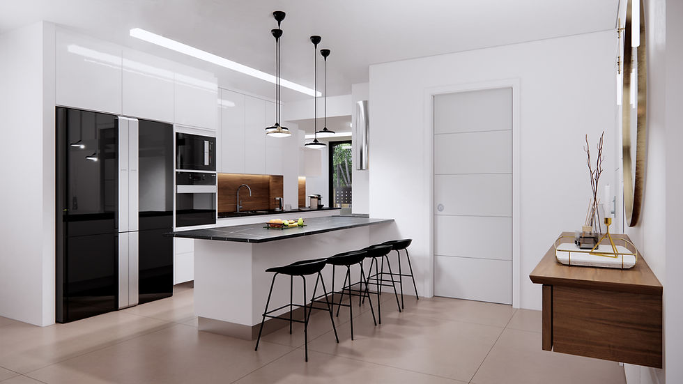
• Casual Comfort – This category is made up of light and warm neutral colours. When combined with the colour white, they are most suitable for entryways, kitchens and open living spaces.
• Calm Zone – This category includes restorative blues and greens. These colours tend to have a soothing effect and so makes a room suitable as a place to seek tranquility and rejuvenation.
• Subtle Focus – This category makes use of soft and gentle but sophisticated colours. These colours create an atmosphere of easy quietude.
• Quiet Haven – The colours in this category are rich and evocative, and so evoke the feelings of surety and tranquility.
• Optimistic View – The colours here are bold and saturated, hence they tend to have a boosting effect on the mind. With such an effect, they will be most suitable for rooms where a person would like to be in high spirits.
• Outdoor Escape – The colours in this group are described to have an easy curbside appeal. They are meant for the exterior of the house and – together with heavy-coloured accents – are most suitable for front doors, shutters and outdoor furniture.
Natural and Serene
The theme of the Pittsburg Paint Company's choice of paint colour palette for 2021 is natural and serene. The colours are supposed to infuse warmth and quietude into the ambience of a room. They are also supposed to be versatile enough to blend well with other colours within the same space.
The colour schemes are as follows:
• Transcend – This colour scheme is in contrast to the time when cool greys were in vogue. As a midtone oatmeal-coloured scheme, it is, however, inspired by the natural earth and nostalgia.
• Big Cypress – This is considered a shade of ginger with persimmon undertones. It creates the feeling of comfort in a room.
• Misty Aqua – This is known as a watercolour cerulean blue. It is supposed to convey the feelings of freshness when used together with warm, earthy hues.
• Be Well – In this colour scheme, the aesthetic appeal lies – first and foremost – in living in a space with wellness as the paramount concern. Colours in this scheme include wheat sheaf and winter peach.
• Be True – Authenticity and connection are the inspiration for this colour scheme, hence, it seeks to magnify the skilled worker's handiwork, as though it were trying to revive the skill. Colours in this palette include best beige and shadow taupe.
• Be Wild – This colour scheme makes use of bold colours – which have a mind-boosting effect – and grounding neutrals. Colours in this scheme include mediterranean blue and cerise.
Clean and Timeless Blues
The colour blue keeps on featuring as a colour of choice from year to year. The paint and wallpaper manufacturer, Farrow and Ball, has continued the trend by selecting clean and timeless blues as its trending colours for 2021.
Such colours as scotch blue, pitch blue and stiffkey blue have a calming effect on the mind. They also come across as versatile, since they can equally be used in combination with other colours.
Comments